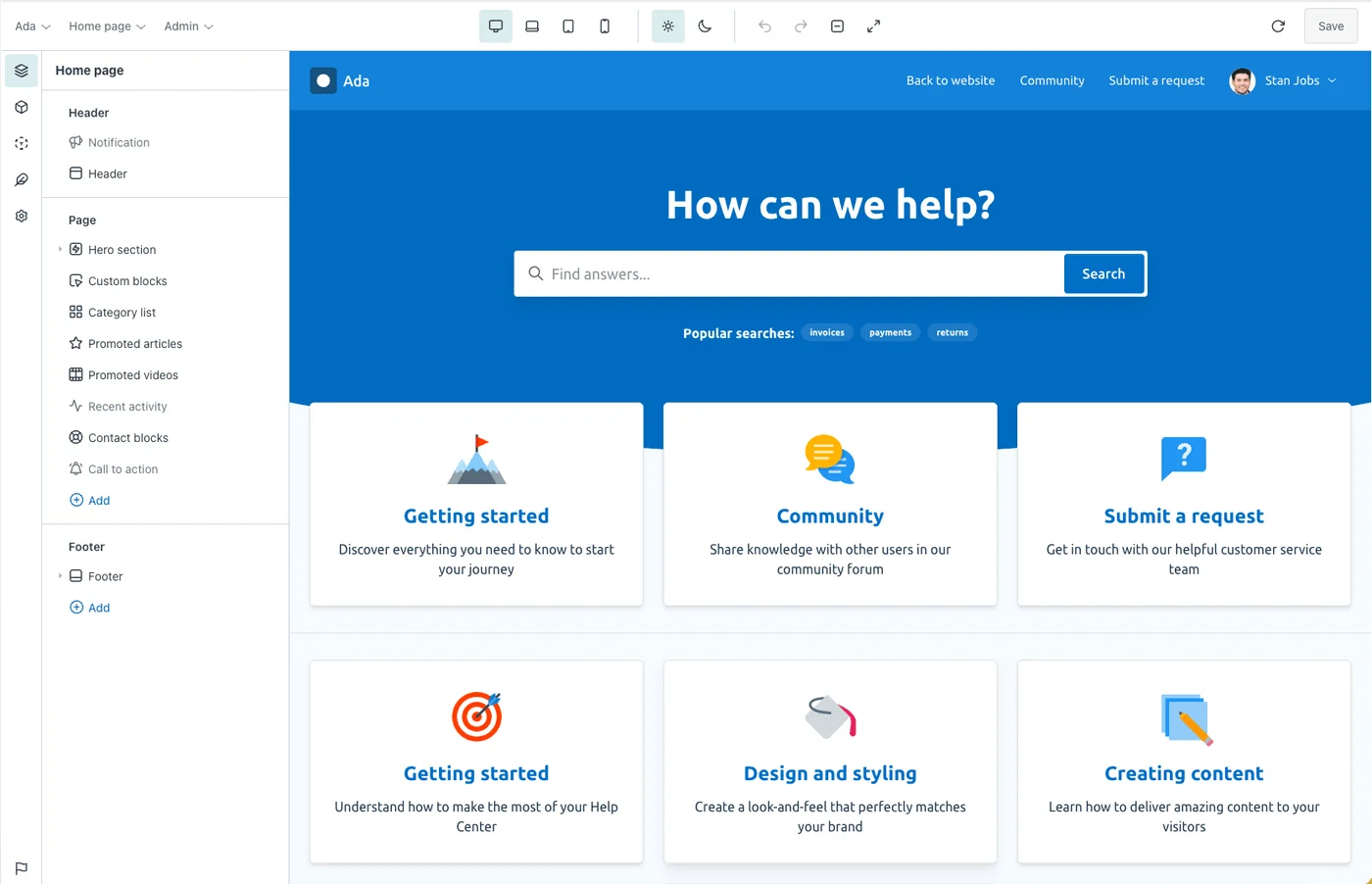
When you open a theme, the visual builder splits into two halves: a set of editing panels on the left and a live preview of your help center on the right. A toolbar across the top lets you choose what you’re looking at and control your session.
The panels
The left side of the editor is organized into five panels, each responsible for a different layer of your design. You can switch between them from the side navigation.
| Panel | What it controls |
|---|---|
| Page elements | The structure of the page you’re viewing—every section, block and component as a tree you can add to, reorder and edit. |
| Global elements | Reusable styled components like buttons, cards, headings, links and form fields that appear throughout your theme. |
| Global styles | Site-wide design choices: color palettes, typography, fonts, layout width, shadows and borders. |
| Formatting elements | The styles applied to content inside articles and posts, such as callouts, blockquotes, code, lists, tables, tabs and accordions. |
| Global settings | Theme-wide options like your favicon, social links, search behavior, animations and translations. |
Each of these has its own article in the Designing your theme and Working with elements sections.
The toolbar
The toolbar at the top of the editor controls your view and your session:
-
Theme — shows the theme you’re editing. Choose Change to return to the dashboard and open a different theme, or Documentation to open these articles.
-
Page — choose which help center page to view and edit, from the home page to articles, categories, community posts, requests and more.
-
Role — preview the page as an anonymous visitor, end user, agent or admin to check role-specific content.
-
Breakpoint — switch between desktop, laptop, tablet and mobile to design responsively.
-
Light mode / Dark mode — toggle between your light and dark color schemes (Multi brand plan).
-
Refresh — reload the data used to generate the page preview, which is cached for performance.
-
Undo / Redo — step backwards and forwards through your recent changes.
-
Zoom and Maximize — zoom the canvas or hide the panels for a distraction-free, full-width preview.
-
Save — write your changes back to the theme. See saving and publishing changes.
The preview
The right side of the editor is a live preview of your help center, rendered with real content. You can click any element on the page to select and edit it—there’s no need to hunt through the structure tree first. The previewing your help center article covers this in more detail.