They come in a variety of shapes and sizes and, like everything else in our themes, can be easily customized to your specific requirements.
Custom blocks are similar to the content blocks and custom blocks which present categories or sections and custom links, respectively.
Adding blocks
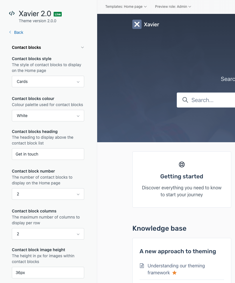
Each theme has a slightly different set of contact block styles, but they’re all built upon the same set of configurable properties.
| Setting | Description |
|---|---|
| Contact blocks style | The block style to use, which can be one that’s built-in or copied from our Pattern Library. Selecting “None” will hide the contact blocks from the Home page. |
| Contact blocks color | The color palette to use, which reference colors defined in your theme. Each block style uses color palettes a little differently and you can use any color you like by modifying the custom micro-template. |
| Contact blocks heading | The optional heading text to display above the contact blocks. |
| Contact block number | The number of contact blocks to display (between 1 and 4). |
| Contact block columns | The number of columns to display the blocks in (between 1 and 4). |
| Contact block image height | The height of each contact block image. If the setting is blank, images will not be displayed. |
You can then configure the following properties for each contact block:
| Property | Description |
|---|---|
| Title | The title of the contact block. |
| Description | The description of the contact block. |
| Link | The URL of the contact block that users will sent to. |
| Image | The image of the contact block. |
The images for each of the 4 supported contact blocks are configured in the Images setting group, whereas the other settings are in the Contact blocks setting group.
Customizing blocks
Each theme comes with a number of built-in contact block patterns that you can choose from using the Contact blocks style theme setting, but you can add additional contact block styles to your theme by:
-
Editing the micro-template of your chosen contact block style on the
footer.hbstemplate. -
Copying a contact block style across from another theme if you purchased our Complete Package.
-
Copying a contact block style from our Pattern Library.
All contact block micro-templates build upon the same set of theme settings but can differ significantly in terms of their look-and-feel and behavior. Contact blocks are built to be customized, so the only limit is your imagination.
Adding new functionality
The URL of each block is configurable through theme settings. Using custom JavaScript on the page, it’s possible to have certain URLs (like those starting with a hash tag) trigger actions.
For example, if you wanted the Web Widget to be hidden by default and then revealed when a user clicks on the Chat with us block, you could configure the block’s URL to be #show-widget and then add something like the following custom JavaScript code to the Home page template (home_page.hbs):
<script type="text/javascript">

  // Shows and opens the Zendesk Web Widget
  function showWebWidget(e) {
    zE('webWidget', 'show');
    zE('webWidget', 'open');
    e.preventDefault();
  }

  document.addEventListener("DOMContentLoaded", function() {

    // Hide the Zendesk Web Widget on page load
    zE('webWidget', 'hide');

    // Add the required event listeners
    var links = Array.prototype.slice.call(document.querySelectorAll('a[href="#show-widget"]'));
    links.forEach(function(a) {
      a.addEventListener('click', showWebWidget, false);
    });
  });
</script>
The example above uses the Web Widget (Classic) JavaScript API which you can use to add more Web Widget-related functionality. There’s also the Web Widget API which you can use with the new Web Widget (i.e., for messaging).