This page describes the settings that you can use to customize the appearance of the hero section. To change the hero section’s layout and the elements within it, use the visual builder.
Background color and image
You can configure the background colors used in your theme’s hero section using the following theme settings in the Home page elements setting group:
| Name | Identifier | Description |
|---|---|---|
| Hero background color 1 | bg_color_hero | Primary background color for the hero elements |
| Hero background color 2 | bg_color_secondary_hero | Secondary background color for the hero elements |
| Hero background gradient | bg_gradient_hero | The type of background color gradient to use |
Selecting different colors allows you to create a gradient effect, which in turn can be controlled using the Hero background gradient setting.
The background image can be edited using the following settings, within the Images and Home page elements setting groups respectively:
| Name | Identifier | Description |
|---|---|---|
| Home hero image | homepage_background_image | The background image for the hero section on the Home page |
| Hero image style | hero_image_style | The style to apply to the Home hero image |
Use the Hero image style setting to control whether the hero background image appears behind the background colors, is used as an overlay or is displayed using a parallax effect.
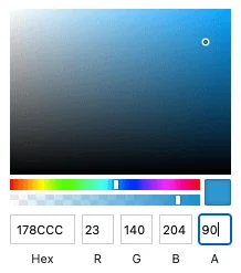
When displaying the hero image behind the background colors, you can use the background colors as an overlay by adjusting their opacity using the color picker settings.
Shape divider
Shape dividers are a great way to make hero sections visually engaging and can also be added through theme settings.
| Name | Identifier | Description |
|---|---|---|
| Hero shape divider | hero_element_shape | The shape divider to use at the bottom of the hero element |